The circular cutout of my previous project gave me an idea: what if I drew a planet next?
I’d bought some red card from Hobbycraft, so Mars was the obvious choice. I always liked the name for Mars, “Barsoom” from Edgar Rice Burroughs’ Mars Series, so that would be the title.
The Map Data
Where to get the map though? Well, while browsing around, I found this blog post. The result of that project is lovely, but its not quite what I’m doing. But, importantly, the author had a copy of the Mars geological survey data in GeoDatabase format.
Hmm, well, I’ve used QGis before for work (and also for fun ;) ), though not for a couple of years. Loading it up yielded what the blog post said, the mars data in an Eckert IV projection. BTW, I’m using QGis 3.2 throughout this.
Use the QGIS Browser to find the SIM3292_geodatabase.gdb folder, then double click the files to open them:
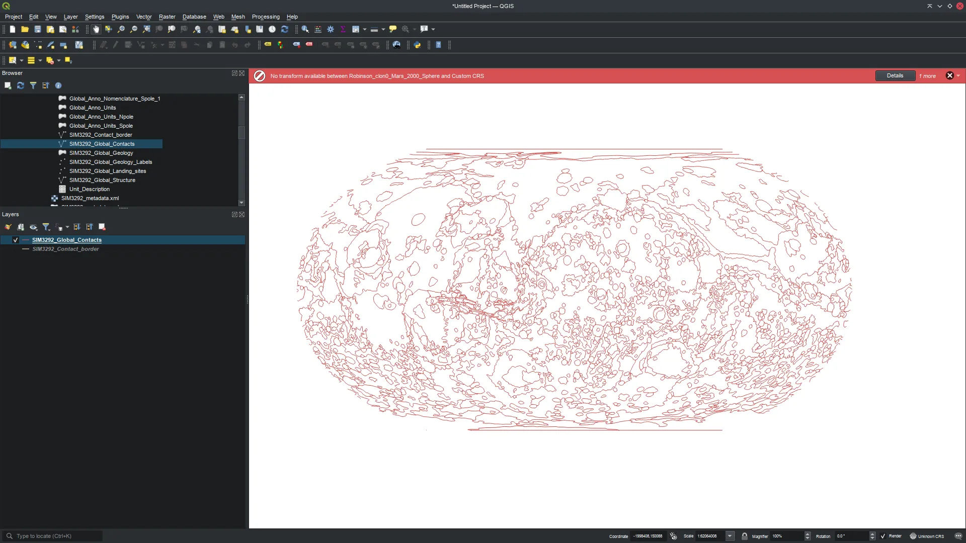
So, problems:
- I want a circular Orthographic projection, not the squished “Robinson” one.
- Its complaining about “No transform available between EPSG:4326 and Robinson_clon0_Mars_2000_Sphere” at the top in red.
Fixing the Projection
These stem from the fact that most GIS work is done on Earth data, and this is an entirely different planet. QGis doesn’t know about the “Robinson_clon0_Mars_2000_Sphere” projection, so - apart - from displaying the data as in the file, its not able to do projection transformations.
More searching… I eventually figured out that this “proj” format projection described the data in the file:
+proj=robin +lon_0=0 +x_0=0 +y_0=0 +R=3396190 +units=m +no_defs
The key is of course the +R=3396190, the radius of Mars in metres (when treated as as a simple Spheroid).
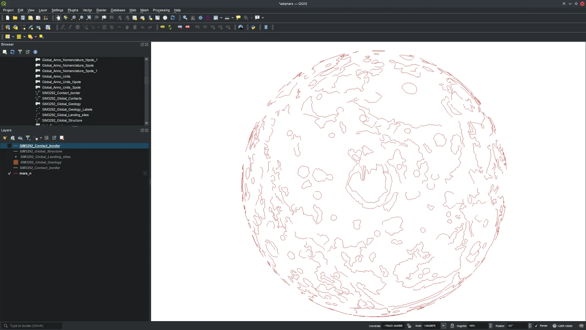
So I defined that as a custom projection in QGis (Settings->Custom Projection) and applied it to the data (bottom right icon, probably reading “Unknown CRS”). This doesn’t make any visible change, but it tells QGis the details of the data its showing. We can now transform it.
Back to the original blog post, the author mentions how to do Orthographic North and South Polar projections. However, I found QGis still had problems: the solution was to add the +R=3396190 expression:
- mars_n:
+proj=ortho +lat_0=90 +lon_0=90 +R=3396190 - mars_s:
+proj=ortho +lat_0=-90 +lon_0=90 +R=3396190
Now, I can just change the projection and the display updates correctly! (This is the north pole of Mars)
Reducing The Map Complexity
I tweaked the data a wee bit to reduce the number of details shown: the underlying data is a set of lines giving the geological boundaries on Mars. In GIS speak anything plotted on a map is known as a “Feature”. You can open up the numerical data attached to the features “Layer>Open Attribute Table”: you’ll see the set of data associated with each feature in a table.
One of these attributes is “SphLen_km”, which I read as the spherical length in kilometres” (Spherical length being along the outside sphere, rather than the direct length between two points).
I added a filter (Layer->Filter) of "SphLen_km" > 400 to exclude any features less than 400Km in length: this cut out loads of noise in my map.
Getting the Data Out to Inkscape
OK, now I need the data in SVG format so I can load it into Inkscape. To do that, you make a print layout (Project>New Print Layout), and add two maps to it. I pointed them at the data I’d been playing with and set one to the N and one to the S projection, giving this:
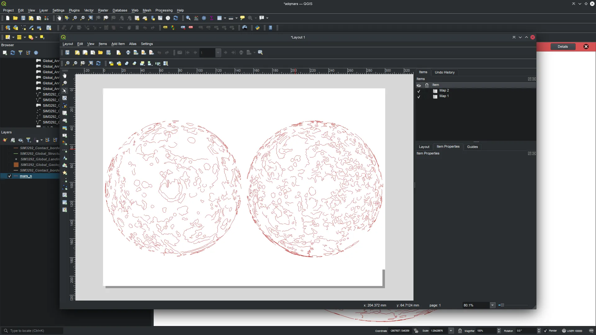
Then, you can just save it out as SVG (File>Export as SVG).
The Title Text
I want to have a nice title on the piece. I’ve been playing Sable recently, and I really liked the title font: it reminded me strongly of French graphic novels. Not really a surprise as the entire thing is rendered like a Moebius comic! I did have a dig around in the Steam project files to see if there were any handy TTFs in there, but no luck.
I grabbed a screenshot of the game:
I threw it into this site I found, FontSquirrel, selected the text, chose all the font repos and let it do its stuff.
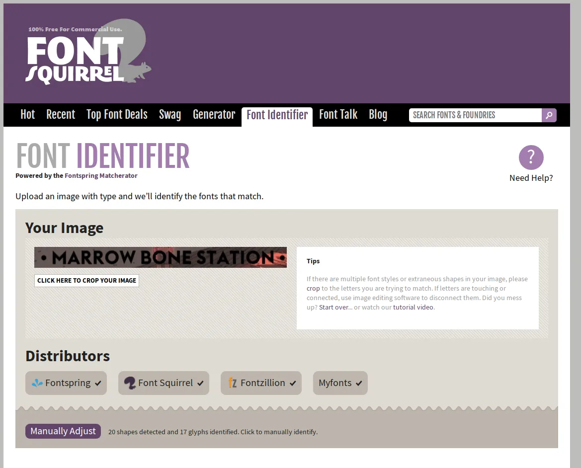
It eventually returned suggesting “Steagal” or “Typographica”. Steagal turned out to be the one!
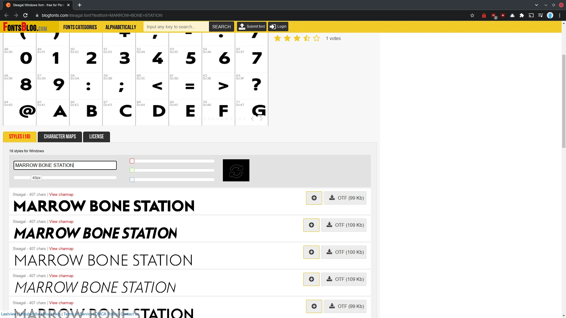
Its a pretty good match. And I can download the OTF file right there!
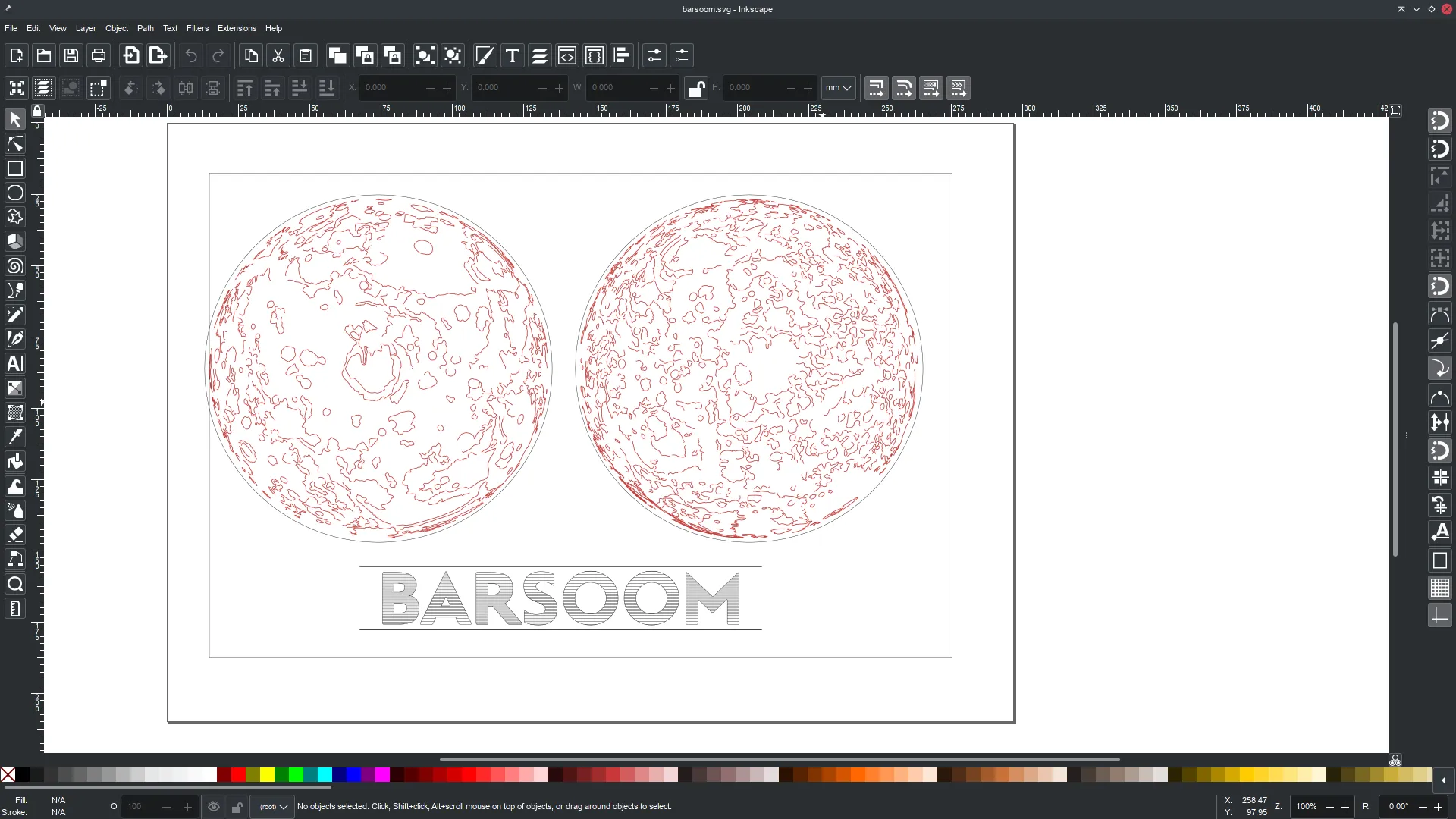
Putting it all Together
- I imported the map SVGs to Inkscape
- Drew circles round each polar map (for cutting circles).
- Put the “BARSOOM” title together. After adding the text, I used the “AxiDraw” Hatch Fill extension to fill the letters out with horizontal dashed lines.
This process has three “printing” stages:
- Draw the map data on a piece of red card with a gold pen.
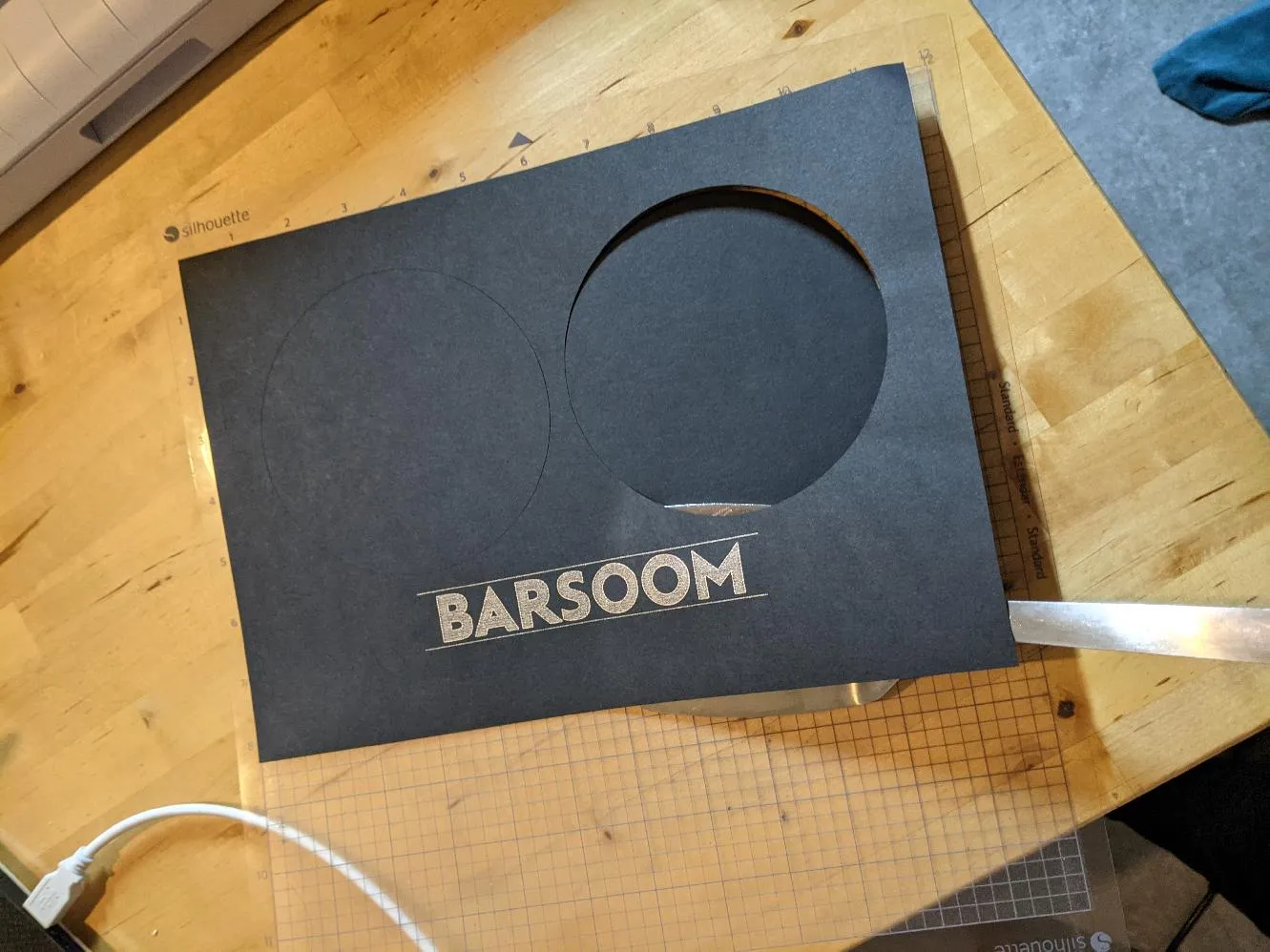
- Draw the BARSOOM title on a piece of black card with silver pen.
- Cut the circles for the polar maps in the same piece of black card.
Between stages 2+3 I switched the pen out for my CB09 cutting tool.
It took a few tests to get everything aligned correctly:
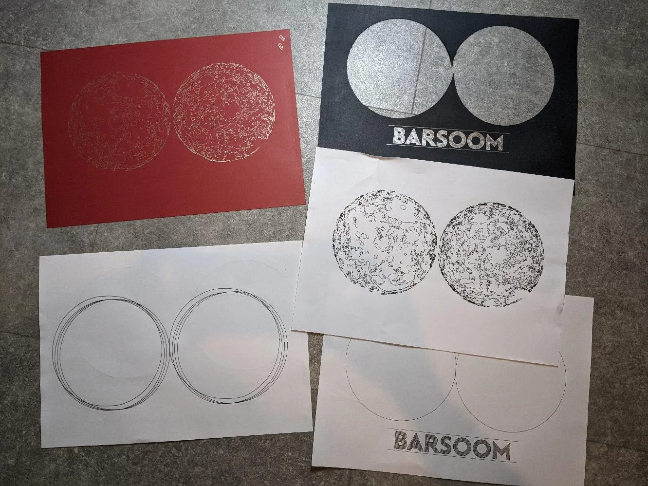
I realised why people always separate the two cutout circles when doing this: otherwise the two black bits between the circles flap up and look rubbish (see top right above).
I found I had to use the sticky cutting mat that came with the die cutter for the black card: because I was cutting giant circles out of it, the rollers kept losing traction.
Removing it from the cutting mat without tearing it was tricky: I used a fish slice!
I used a cutting speed of 14 and a pressure of 10 for all parts of the process.
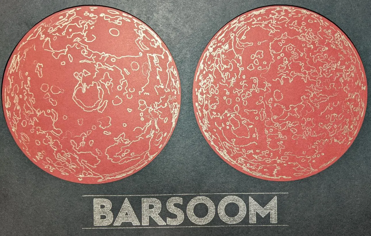
The Result
Eventually, I had all processes done, and the result is this! I just need to get a frame now.
Leave a comment
Comments are moderated, so yours won't appear immediately. Your email is never published.